Tuesday, January 29, 2013

King Kirby Kaleidoscope

I've known of the existence of King Kirby Kaleidoscope for a while now but bought it just recently. I am very pleased with my purchase!

Printed overseas, this book is a love letter to Jack Kirby from a number of European artists. I like the way they show the penciled version of a Kirby drawing side by side with an inked version of the same drawing. Isn't the above interpretation of OMAC by Ramon Bernado quite impressive? (Of course I've tried my own hand at inking Mr. Kirby, as I showed you back here.)

Some of the excellent artists represented in Kaleidoscope are Marcos Martin and Javier Pulido and Alvaro Lopez. I would encourage any Kirby fan to seek out this book!

Monday, January 28, 2013

Wally Wood in 1978


Some photos I can look at for one hour straight.

This is one of those photos.

Sheldon Mayer Drew Batman?


Sheldon Mayer is probably best known for his wonderful Sugar and Spike series, but please don't minimize his importance in the realm of superheroes. He was, after all, the DC Comics editor who in the 1930s yanked Superman out of the rejection pile! He even created Black Orchid for Adventure Comics in 1973 but, more interesting to me, Mr. Mayer took a couple of swings at writing and drawing Batman in the 1970s/1980s.

Above are some penciled pages by the gentleman that never made it to print; you'll find larger versions to investigate over here. There was even a proposed tabloid-sized All-New Collector's Edition in 1980 featuring Batman and The Joker in a story to have been titled "The Face of The Grim Reaper" but that also did not get published; original vellum pages are available on ebay at the time of this writing and, while it lasts, here is a link to some of that artwork.

Sunday, January 27, 2013

Heavy Metal and Me

Starting in 1977 and continuing for two decades I purchased every issue of Heavy Metal magazine as they were released. In its early or early/middle years John Workman was the Art Director and I liked seeing his lettering on the translations of the many European stories, but my interest waned and I just stopped buying it.

I spotted the latest issue of Heavy Metal in the bookstore recently and I was burning off a gift card anyway so, why not, I pulled the trigger. I would describe this copy I have as a nice enough package, but not enough to lure me back as a regular customer. The single most interesting thing in the issue is a house ad showing a partially obscured painting by the unusual team of Jim Steranko and Stanley (Artgerm) Lau.

I did a little investigative work and found the full image to share with you above. It turns out this was to have been a variant cover to my issue of Heavy Metal, but the variant was cancelled. Hey, wait a minute. Isn't that Simon and Kirby's Fighting American?


Saturday, January 26, 2013

The Silence of DeMatteis

I have been a fan of the writing of Marc DeMatteis for a few decades now. The gentleman has posted a new article on his blog in which he discusses the power of silence on a comic book page. I agree with what he has written.

As an introduction at the top of his blog Mr. D notes that "The impossible isn't a limitation, it's an invitation." I agree with him about that also and I am adding that nugget to my collection of quotations.

Thursday, January 24, 2013

Here's Paul Hornschemeier

Paul Hornschemeier is the party responsible for the above last page in the latest issue of Chicago Magazine (which I suspect some of you do not receive). A slightly larger version of the artwork can be viewed over here and here is a peek at more of his artwork over here.

Paul was the colorist of the 2007 Omega the Unknown miniseries for Marvel Comics and his own artwork has been published by Dark Horse and others. He has written about lettering on his blog so you know I like to migrate over there when I can.

Wednesday, January 23, 2013

Steranko's Heroes

Here's a great drawing by Jim Steranko that I don't remember seeing previously so maybe you didn't either.

Tuesday, January 22, 2013

Jack Kirby and The Mountain of Judgment

When Jaime Hernandez yesterday tweeted an image that he titled Mountain of Judgment, I started salivating at the prospect of seeing that great artist's take on a classic Fourth World concept. It was a bit of a letdown to discover that he was sending out just the above photo of a little hill.

My happiness returned when I did a Google Image Search for "Mountain of Judgment" and four of the seven images in the top row of results depicted the Jack Kirby creation I had wanted to see. Now this is what I call The Mountain of Judgment!


Monday, January 21, 2013

Panel of the Day? The Joker!

The Brotherhood of Evil Geeks blog reliably posts a Panel of the Day from a comic book. The Joker is centerstage for today's selection from the latest issue of Batman, as pictured up above. Excellent choice! You can get your daily dose of the Evil Geeks over here.

William Dozier Says POW!


As I told you back here, it was only recently that I learned the narration for the 1960s Batman TV show was provided by producer William Dozier. Mark Evanier has unearthed the above fun video of Mr. Dozier being interviewed on the set of that show about his dual role. I hope you enjoy it as much as I did!

Sunday, January 20, 2013

Nodell Tower

Last week's episode of Arrow referred to Nodell Tower, a nod to Golden Age comics artist Martin Nodell. Mr. Nodell (whose portrait above is drawn by Michael Netzer) was the designer of Green Lantern and drew the character for DC Comics throughout the 1940s (as well as Captain America and others for Timely Comics). I saw the gentleman a number of times in the Artists Alley at the Chicago Comicon in the 1990s; he and his wife always seemed so jolly at their table that they reminded me of Mr. and Mrs. Santa Claus.

Patricia Hussey was my office partner for 27 years up until she retired a year or two ago. It was maybe ten years ago that Pat returned from a math teachers convention and told me that she had been seated on the plane next to the creator of Green Lantern. Of course I knew who she meant immediately. Pat said she had had a good conversation with him and that that he was a very nice man.

Saturday, January 19, 2013

Until Death Do You Part

Here's a gentleman who, with his groomsmen, wore superhero cufflinks at his wedding. Congratulations to him on his nuptials! I wonder if he also thought about wearing Ugg boots a la Mike Sekowsky to take the superhero motif to the brink?

Friday, January 18, 2013

Superman and The Incredibles


This is an unreleased movie poster by Robert McGinnis and was tweeted out by Brad Bird, the writer/director of The Incredibles. Mr. McGinnis famously painted the posters for Barbarella and a number of James Bond films and I like the way he made the shadows on Mr. Incredible's rib cage form a Superman S!

Thursday, January 17, 2013

My World's Finest for TBG

Make ready your cell phone cameras! Throw your handfuls of rice! Before your very eyes, two previous Hamfamzone Blog articles are getting married!

Back here I told you about the unfortunate demise of The Comics Buyer's Guide (TBG) and back here I told you about a collector's excellent World's Finest art commissions. I have subsequently recalled that I myself drew a page in 1982 featuring Superman and Batman (with special guest Captain Marvel) having a conversation about the then-current state of World's Finest Comics, and the page was published in TBG #439. That's my drawing up above, and you can see a larger version over here.

Wednesday, January 16, 2013

The CGCization of Today's Youths

FIRST QUESTION
Do you remember reading and enjoying comic books when you were a youngster? The great feeling that the experience gave is the reason most of us continue reading comics into adulthood.

SECOND QUESTION
Do you remember displaying hermetically-sealed comic books on your mantle like safari trophies when you were a teenager? Whoa! Stop the trolley!

Over here you can see a  crystal clear version of the grainy photo shown up above. It shows a shelf in a teenager's bedroom and on the shelf are her collection of Beanie Babies and her framed comic books featuring Iron Man and Spider-Man and The X-Men versus The Teen Titans. Were comic books ever meant to be framed? Did the young lady ever read those comics? For that matter, did she ever play with her Beanie Babies? Have comic books and toys been reduced to interior design accents?

The source of the above photo is Chronicles of a Bed Unmade (A new Web site takes readers behind the velvet rope of adolescence), a New York Times article by Michael Tortorello that you can read for yourself over here. And maybe you'd like to read again what I've written about CGC and sealed comics over here.

Tuesday, January 15, 2013

The Anatomy of a Font

Nate Piekos of Blambot Studios has written an article detailing the process he went through when designing the hand-lettering computer font to grace the pages of the Black Beetle miniseries from Dark Horse Comics. Mr. Piekos points out in the article that he strove to make the lettering appear "less computer perfect." A link is provided there for a ten-page preview of Black Beetle #1 which is definitely worth a look.

Monday, January 14, 2013

Wall of Comics

Back here I told you about comics being used in classrooms and I mentioned a photo that appeared in print accompanying a published article but which I was unable to locate anywhere online. I've taken a photo of the photo so I could show it to you above.

Do you see the comic book above the center student's head? No, I don't mean the Prez! That's Batman #1! And Flash Comics #1! Well, probably not. Keep in mind that this is a school setting and it's not tremendously likely that comic books worth tens of thousands of dollars are being pinned to the wall. Probably those are color xeroxes on display.

I like the picture anyway and I wanted to share it with you.


Typewriter Head

Sometimes we hayfamzonders, you and I both, need to take a couple of steps back from the comic book longbox and look at the wider world of art. I had to share with you this phenomenal  Portrait Made from Typewriter Parts!

You can read more about this masterwork over here.

Jack Kirby Times Two

Above is by Alex Ross and below is by Drew Friedman.
Both are GREAT!


Sunday, January 13, 2013

DC Nation Has Returned

Last year I told you about the excellent Green Lantern cartoons and now DC Nation is back with new episodes. Beautiful animation, thoughtful storylines, crisp dialogue. The sixty minute cartoon block also includes a Young Justice episode (featuring appearances by many DC Universe characters) and two stylistic minute-long shorts (yesterday's entries were an anime-influenced Catwoman and an Amethyst, Princess of Gemworld), but headliner Green Lantern is the star of the hour. Sleep late on Saturday mornings? You can watch recent full episodes over here on the Cartoon Network website.

John Byrne's Time Machine

John Byrne wrote on his website this week that he would say no thank you if he could go back in time to the day when Dick Giordano broached the subject of Mr. Byrne writing and drawing the 1980s Superman reboot. No reason was given for his statement.

The gentleman also tells what he would have done differently regarding Phoenix and Wolverine. You can investigate these comments for yourself over in this thread of the Byrne Robotics Discussion Board.

Comic Book Bootcamp

Do you know that artist Ty Templeton teaches a Comic Book Bootcamp? Though not accredited as the Joe Kubert School is, Mr. Templeton's courses run the gamut of the many facets of producing a comic book for either print or online publication. Here is where you can view some pages produced by Bootcamp alumni and here is information about upcoming classes.

Saturday, January 12, 2013

DC Database Error


There is a page in the DC Comics Database website that delineates the history and evolution of the "DC" logo that has appeared on their comics covers for eight decades. Milton Glaser's widely appreciated DC Bullet above reigned from 1977 to 2005, but it was shoved aside in favor of the DC Swirl:
Maligned upon its unveiling for being so similar in nature to the Nike Swirl and a multitude of other swirl-based designs, the DC Swirl is said on the DC Database to have been referred to as the DC Spin (although I never heard anyone refer to it as that). The DC Swirl was given the heave-ho in 2012 and replaced with what I will call the DC Peel:
Many observers (including me) believe that the DC Peel is one of the worst logos of all time, not just in comics but anywhere in the business world. Instead of boldly proclaiming its brand, one of its letters is hiding behind the other and this results in both letters of a two-letter logo being obscured? Sheesh!

Anyway, the error on the DC Database page is that there is mistakenly a Peel in the field where the Swirl is being described and the Swirl appears nowhere on the page. How about if we all concentrate really hard and maybe we can collectively will the Peel to appear nowhere also? I would be quite fine with the beautifully bold DC Bullet returning to its rightful prominence on the cover of every DC comic.

Friday, January 11, 2013

Steve Mitchell's Zipatone

Of course I've written yearningly about zipatone previously, and now the Zipatone Storage Drawer from artist Steve Mitchell's studio is up for bid on ebay! Here is the link to the auction while it lasts; the bidding ends three days from this writing. The wording of the item description suggests that it is Mr. Mitchell himself doing the selling. I will historically document what he wrote by sharing it with you here:
Hey comic art fans, here is an interesting collectible from the studio of BATMAN and IRON MAN inker...STEVE MITCHELL.

Back in the pre computer era, artists and inkers like Steve, used ZIPATONE, and LETRATONE, to create textures and special effects on the pages they created for MARVEL, DC, DARK HORSE, and the other publishers of the day.

This heavy and heavy duty storage unit - five drawers -  was created to make some organizational sense of the many sheets an artist may have at his disposal.Believe me most inkers had a lot of sheets somewhere near their drawing board(s).

While this is a relic of the analog era of comics, it is a unique collectible from the studio of an inker who worked in the business for over three decades. With thousands of pages to his credit, Steve, in the great tradition that began before he matriculated into comics, used bits and pieces of these adhesive backed dot patterns, cross hatch textures, etc. to give a panel a bit more... oomph.

As you can see in the pictures you will be getting a lot (too many to count) of partial sheets of textures, dots and patterns along with quite a few sheets of Letraset transfer type, which was used by artists, designers, art directors back in the day.

Hard to believe that this is now an antique, but it kind of is. I used this unit for a long time, and it is time to pass it on to another artist or fan of the way things were done in the good ol' days.

Thursday, January 10, 2013

Goodbye to The Comics Buyers Guide

The Comics Buyer's Guide has ceased publication.

I learned of The Buyer's Guide for Comic Fandom (TBG) on the letters page of the second or third issue of Jack Kirby's Kamandi in 1972 and I subscribed immediately. I think #19 was the first issue I received in the mail. Mostly an adzine in newspaper format, TBG did however feature a nominal amount of editorial content. Now What? by Murray Bishoff was my introduction to the intoxicating realm of comic book news that I have had an insatiable hunger for ever since. The paper was published biweekly at first but then upgraded to weekly in about 1976 and I looked forward to receiving it in the mailbox every week.

TBG helped me cross the borderline from reader to (gulp) creator. Don and Maggie Thompson published a few spot illustrations of mine in their 
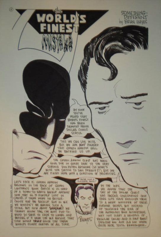
Beautiful Balloons column in the late1970s and, by 1980, I had drawn a handful of covers for the newspaper (my X-Men cover to 1979's issue 304 is shown up above). Fred Hembeck rose to fame drawing for TBG; Terry Beatty took his place when Fred left and, when Terry announced in early 1982 he was leaving I drew up a sample comic commentary page and sent it in with the offer to draw more on a regular basis. I was as pleased as punch when editor/publisher Alan Light wrote back that I should keep the pages rolling in. Thank you, Alan, for that nod! (Here is a nice article to which Alan and Murray have posted comments, and here is Mark Evanier's take.)

Alan sold his creation in 1983 to Krause Publications. The new publisher reformatted TBG to more closely resemble an actual newpaper and they included more articles. They renamed TBG as The Comics Buyer's Guide (CBG) and installed the Thompsons as editors. The change in appearance to the paper was jarring at first but I came to like it (even though my cartoons no longer appeared at full-page size). In the 1990s the format changed again, this time to a magazine, and my interest in it waned.

I keep a list of things that I used to like quite a bit but which are no longer available. (Most items in the list are food products like Kellogg's Concentrate cereal and the Marathon candy bar.) I now reluctantly add TBG/CBG to that list.

Wednesday, January 09, 2013

So Many Batmobiles

These look nice.

Eaglemoss Collections is a British company that is manufacturing an set of die-cast Batmobiles and you probably won't believe how many different designs there are! Of course the instantly recognizable model from the 1966 television show is in the set, but do you remember the Batmobile that appeared in Detective Comics #400? Eaglemoss does.

Each car is encased in a glass cube and is accompanied by a twelve-page booklet telling the history of that model. You may have to work hard to purchase these beauties because they're manufactured for the European market, but I know you can swing it if you want to. Here is the Eaglemoss website, and you'll be able to get even more details over on the Bat-Blog.

Tuesday, January 08, 2013

The World's Finest Commissions

I met a gentleman named Toby Mays on ebay last week. Toby has built up an extensive collection of commissions featuring a splash page of Batman and Superman, just like they appeared together for so many years in World's Finest Comics, and I thought I'd show you a handful of them. The beauty above is by Shawn McManus and the one below is by John Byrne.
Here's one by Steve Rude:
And this fun one is the handiwork of Chris Giarusso:
You can see many more in Toby's Gallery Room devoted to this series over here, and he's even letting go of some pages in his collection over here on ebay. (I also invite you to take a look over here at Toby's own pencils as inked by a number of different pros that you know.)

Monday, January 07, 2013

Captain Flash on DVD

 I receive and watch a DVD from Netflix every four days or so. One of my discs last week was The Projectionist. I'm not surprised if you never heard of the film; even though it dates back to 1971, I first learned of it only recently myself. Its being such a secret is a shame because the film has quite a bit of both charm and panache.

Chuck McCann plays the title nebbish and the movie follows him from his New York City movie house projection booth to his small apartment and it makes sure to show all his stops in between, especially the ones he imagines! This is a Secret Life of Walter Mitty plopped down right in the middle of late 1960s counterculture, with precursors of what Zelig and Forrest Gump would do years later.

Mr. McCann's imaginary avatar is a costumed hero named Captain Flash; he envisions himself as the good Captain interacting within the celluloid frames with the characters in Casablanca and other classics. My curiosity was piqued when McCann was shutting down his projectionist booth one night and popped off excellent impressions of old-time actors one after another. I looked up the gentleman to see what he's been up to for the last four decades, and his resume includes a great deal of voicework for cartoons (including some for Thundarr the Barbarian which Jack Kirby also worked on in the early 1980s).

This is not a movie for kids because of a couple of the scenes (nice going, counterculture), and I wouldn't say that every comics fan should see it, and I won't even go so far as to call it a good movie. But I found it interesting and I liked it and I believe any serious student of film should experience The Projectionist.

Sunday, January 06, 2013

The New Jack Kirby T-Shirt

Jack Kirby's grandson Jeremy has designed a cosmic-crackle t-shirt with a halo around my favorite of the Kirby signature styles. The look is very sharp and the shirt may be purchased through Jeremy's ebay store.

Saturday, January 05, 2013

In Solidarity with Peter David

Peter David is a great writer. I watched a couple of decades ago as he transitioned out of a staff position at Marvel Comics and became a writer full time. I enjoyed his Spider-Man and Hulk scripts, and then he crossed the street to DC Comics and did a wonderful job on Aquaman and Supergirl, and now he's been back at Marvel writing X-Factor since about forever. I appreciated his style so much that I bought Knight Life, his first novel, when it was published in 1987 (although I have not read it yet. It was Harlan Ellison who said that it would be ridiculous to own a library in which every volume had already been read, right?). Do you remember that Mr. David was the Guest of Honor at the 1995 Chicago Comicon and that it was his suggestion that led to the wonderfully entertaining McLaughlin Group panel at a number of WizardWorld conventions?

You've probably heard that Peter David had a stroke last week. His recovery is off to a very good start and this would be an excellent time to buy some of his books you've been meaning to, to help him out. Mr. David's wife Kathleen has been blogging daily progress reports over here, and that same page has links where Peter's writings can be conveniently purchased. Hooray for Peter David! Our best hayfamzone wishes go out to the gentleman.

Friday, January 04, 2013

A Very Funny Tweet


Just had 3 customers in a row (not friends) buy Zaucer of Zilk #2 ! What the hell?

Thursday, January 03, 2013

Courtroom Sketching and Comics Lettering

Thomas Gianni of Chicago started courtroom sketching over thirty years ago. But it's a dying artform. This article from yesterday's Chicago Tribune focuses on how cameras being allowed in courtrooms is reducing courtroom sketching to a quirky anachronism. Mr. Gianni counters, though, that a sketch artist can juxtapose or highlight images in ways that a photograph cannot.

I immediately thought of a parallel to the comic book world. Formerly universally done by hand, a majority of comics lettering is now done by computer instead. As I continue to point out though, the organically-less-than-perfect quality of hand lettering is far superior to the mechanical uniformity of computer lettering. I must confess that the recession of hand lettering saddens me more than that of courtroom sketching, but really I don't want any artform to be lost because of technological convenience.

Let me tell you a couple more things about Tom Gianni. He painted a mural in a library that is mere minutes away from Castle Hayfamzone (and here is a video of him explaining that project) plus he is working on a graphic novel entitled Mechanic Anna (which maybe you can find out more about over here on his website). Hmmm, I wonder whether Mechanic Anna will feature hand lettering or computer lettering...

Tuesday, January 01, 2013

Stan Lee is the New Andy Rooney

Have you already been following Stan's Rants? I just today stumbled across my first one but it appears there have been many. These Rants are YouTube videos of Stan Lee pontificating for a minute on a topic of his choice. The one I've seen is about the robes that the United States Supreme Court justices wear. You can watch that video for yourself over here, and then a gateway will open so you can watch the others in the series. Hooray for Stan Lee!