Two Shades of Action Comics
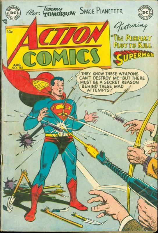 |
| Action Comics # 183 (August 1953) |
Ah, Action Comics. The venerable home of Superman has been going strong every month since June of 1938, almost 1000 issues by now.
Take a look at the cover shown above. Please notice that the "Action" and the "Comics" in the logo are colored differently. I hate that! So jarring. Fingernails may just as well be scraping along a blackboard. Please join me in coining the word cacochromatic, which will mean "containing or using a harsh mixture of colors."
Maybe you're as curious as I was as to how many times this eye-poke of a color scheme was employed through the years? Well, I did a little research so we could settle this matter once and for all.
Issue #149 in 1950 was the first appearance of a two-shaded Action Comics logo, so there was smooth sailing for the first twelve years of publication until somebody latched onto this bright idea. It was employed a total of twelve times between 1950 and 1954 (issues 149, 150, 166, 167, 168, 173, 178, 183, 191, 192, 193, 194), and then there was a monochromatic tranquility for the next 51 years.
Issue 824 in 2005 was the next time the monster of two colors presented its grotesque visage (but it must be pointed out that there was a different Action Comics logo from 1989 to 2004, one that did not allow for double coloring). The new generation of colorists and/or editors were apparently hypnotized by this terrible tincturing because the dichotomous dying was applied 40 times between 2005 and 2016.
Have you added up all these covers for a grand total? Me neither. "Too many" is the answer. It never should have happened. How visually offensive it is when "Action" and "Comics" are colored differently! If I could go back in time I would make sure that this two-pronged pigmentation never occurred a single time.
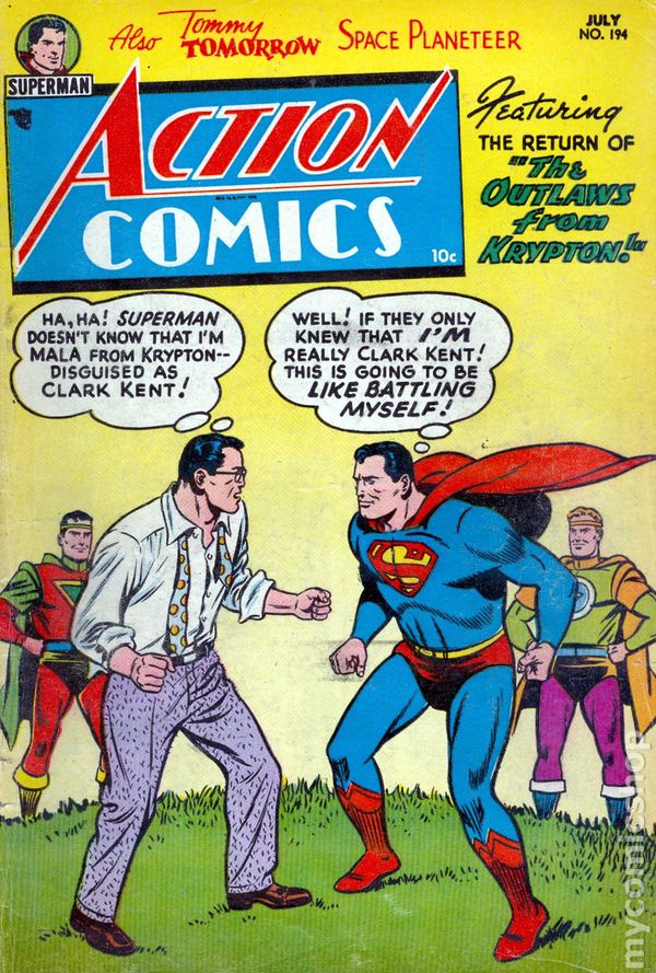 |
| Action Comics # 194 (July 1954) |

0 Comments:
Post a Comment
<< Home