Not the World's Finest S
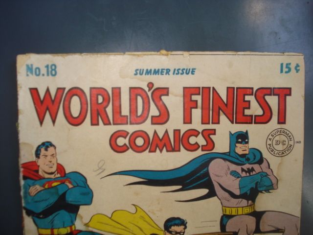
This week over on ebay I'm selling World's Finest Comics #18 from 1945. Great year, fun comic, Golden Age, what's not to like? I'm so glad you asked!
Look up above at the S in the cover's logo. Not in World's or in Finest, look at the S in Comics. Ouch, right? Akin to a needle in the eye, wouldn't you say? As an upside down and backwards 2 it wouldn't be so offensive but, as an S, it is the worst.

It's only a very slight bit different from the two S's that precede it in the logo's top tier yet it is jarringly atrociously ugly. This illustrates why an editor is crucial in the production of a comic book. The letterer of that S knew it was bad (how could he not?) but maybe he was in a hurry or maybe he felt it wasn't so bad that it needed re-drawing. I hold the editor responsible for not hauling the letterer into the office and saying "Your S assaulted my eye and I need you to fix it right this minute while I go put on a patch."
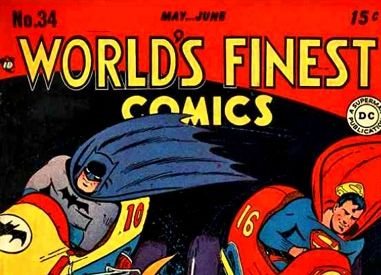
Amazingly that exact logo survived through World's Finest #33, but then a welcome improvement arrived with the 34th issue.

0 Comments:
Post a Comment
<< Home