Wednesday, February 29, 2012

Mitch O'Connell's Lollapaloosa

Mitch O'Connell is a great artist who sometimes draws comics. You must remember his and Mike Baron's beautiful World of Ginger Fox graphic novel. Also he has drawn spot illustrations for many popular magazines. I'm crazy about his super-slick style.

I've written in the past that I intended to publish a comics fanzine in the mid-1970s, but didn't. Mitch O'Connell intended to publish one also, and he did. Named Lollapaloosa and running five issues in the late 1970s, it was a sharp little package. Printed on very heavy white paper, it featured some pro drawings and some stories that Mitch wrote and drew himself and articles on Batman and on EC Comics. I believe that my fanzine would have been very much like this one! Maybe you'd like even more evidence that Mitch and I were like-minded in our publishing outlooks? Remember this great Captain Marvel drawing I commissioned from Mr. Kurt Schaffenberger for my proposed zine? Well Lollapaloosa #5 features a full-page poster of the same Big Red Cheese!

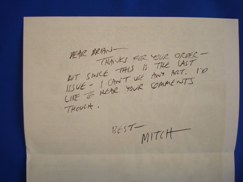
When I sent in my order for Lolla #5, I included a note to fellow Chicagoan M. O'C about the possibility of me submitting a drawing for a future issue. Mitch included the note I've reproduced above with the issue he sent me. I never did send any comments to Mitch about his great fanzine, at least not until writing this little article. Some items take thirty-two years to get crossed off the checklist. Welcome to my hayfamzone.

Thursday, February 23, 2012

Social Networking Squandered


The DC Comics Facebook Page invites readers to send in photos that they took of one or more of the DC titles that were released that week, and then many of the photos are posted on that Facebook Page.

But why?

Here is what the page looks like. Why, why, why? This is the doing of something just to be doing something. So that something valuable will come of this silliness let's at least coin the new word "nontent," short for non-content. DC, I know that you can come up with a better idea than this.

Wednesday, February 22, 2012

Sufferin' Succotash


Let me name some magazine titles (don't worry, this will be fun): New York, The New Yorker, Chicago, The Chicagoan. I told you it would be fun. And no, you're not seeing double!

New York Magazine and Chicago Magazine are produced for the locals of those towns, whereas The New Yorker is produced for the world. (And that magazine has definite comics connections: Maus creator Art Spiegelman has done some great work for The New Yorker (like the above Plastic Man cover delicacy) and, in fact, his wife Francoise Mouly (with whom he published Raw Magazine thirty years ago, in which Maus first appeared in serialized form) is the longtime Art Director of the magazine (and she was herself even a colorist for Marvel Comics in the late 1970s).)

In the 1920s and 1930s, The Chicagoan was published using The New Yorker as its template. A coffee table collection of highlights came out a few years back and I thought very highly of it. This week, The Chicagoan returned as a periodical, and I am here to tell you today that is is quite an excellent magazine. I like the look of it, the shape of it, the feel of it, the heft of it, and yes, even the content of it. I like everything about it!

I knew last week that The Chicagoan would be coming out with a very limited print run of just 5000, so I wanted to plan ahead about reserving a copy. I went to a certain retail location that will go unnamed and asked if they would be receiving a shipment. The gent looked up "Chicagoan" on his inventory computer but came up with a listing only for that hardcover that I mentioned above, nothing for the upcoming magazine. Dejected, I went home. I tried to think of ways to find out where I was going to be able to secure my copy.

Two days later I had the bright idea to look up The Chicagoan on Twitter and BINGO! I struck gold. They were tweeting location after location where the magazine could be purchased. "Pop-up newsstands" they called some of them. In came a tweet that the same spot where I had gone asking just days before (and where the attendant had had no idea what I was talking about) now had the magazine in stock! I hurried myself over there and asked for The Chicagoan. The attendant (not the same one as on the earlier day) pointed to the rack where Chicago Magazine was and I scanned around but didn't see what I was looking for. A pure exercise in pantomime ensued, as I inquisitively looked up at the attendant and then he pointed to that same rack again and then I scanned around again and I came up dry again. Had I been slurring my words like some overgrown Sylvester the Cat that the gent couldn't hear what I was asking for? As I stood up and spun around, I happened to spot an individual rack on the main counter and it was devoted to (yes!) The Chicagoan. My fingers fumbled onto one of the three remaining copies and away I went.

I applaud the strategy of the "limited" rollout of this magazine and the whole concept of "pop-up newsstands" as a plan for selling it. Far more energy and excitement were generated this way than if TC (sorry, but I'm getting tired of typing "The Chicagoan!") had just matter-of-factly shown up at bookstores. The Hayfamzone Blog wishes much good luck to TC (and you can follow both of us on the Twitter!).

Monday, February 20, 2012

A Current Event in the News


Did you hear that the guy who wrote the Knock Knock jokes has won the Nobel Prize?

(Okay, okay, so this is a joke and not a current event at all. But I felt compelled to share it worth you since Poth rated it as the funniest thing she has ever heard in her life. It's probably good for the world to realize that those of us encased in the hayfamzone are subject to flights of whimsy on occasion.)

Saturday, February 18, 2012

Comic Book Men, NOT!

Last week marked the debut of Comic Book Men on the AMC cable television channel. It is a reality show that takes place in the comic book store owned by movie director and comic book writer Kevin Smith.

I hated it.

"Reality show?" I have frequented comic book stores for forty years now and what I saw on this show had no bearing on any reality I have ever observed in a comic store. Anyway, most of the episode took place in a back room (where the owner and workers sat around a table chatting instead of tending to the retail area) or at an off-site flea market.

The centerpiece of the show seems to be a warmed-over version of the blockbuster Pawn Stars show that airs on the History Channel; weird customers bring their collectibles in and try to sell them to the guys at the counter (and the guys made what I felt were unrealistically generous offers for those items on this first episode).

(As a brief aside, let me explain the high regard I have for Pawn Stars. I never had cable television in my life until six months ago. (I was, for example, curious about the 1990-1993 Swamp Thing cable series but I did not see a single episode.) I changed internet providers last September from broadband to cable and decided to try the deal on cable TV while I was at it. I immediately gravitated to Pawn Stars even though I had never given a second glance to any reality series in the past. I enjoy watching those pawn shop proprietors and the items brought in are interesting and I feel the offers made to the sellers are believable.)

On Comic Men, Kevin Smith was the discussion leader of the backroom chats, and I think the show would have benefited if his professional credentials had been presented. I think it should also have been made clear that shopworker Walt Flanagan was the artist of Smith's two Batman miniseries, Cacophony and The Widening Gyre. Omnipresent customer Bryan Johnson is also a creator who has written some comics. This show wants to suggest that its characters are your typical fans on the street but it just isn't so and, because of that, the entire production reeks of artificiality.

One thing the show does correctly is get in a few mentions of Jack Kirby. Everyone involved speaks of him reverently and that does not seem artificial. But they referred to and discussed "Kirby dots." I looked it up and yes, the phenomenon is sometimes referred to by that name, but "Kirby Krackle" is the more widely used descriptor, not to mention being far less generic sounding. (The lettering adorning the top of this article is the logo for a rock band out of Seattle that took Kirby Krackle as its name.)

Friday, February 17, 2012

Alan Moore, Editor and Publisher

Alan Moore wrote some great comic books in the 1980s and some good ones in the 1990s.

For many years now, though, his curmudgeonliness has been more prominent to this observer than his writerliness. Especially with DC Comics recently announcing plans of publishing Before Watchmen, statements and videos from a disgruntled Alan Moore seem to be as plentiful in the universe as atoms of hydrogen.

But wait, here's a tidbit you may not know about the man.

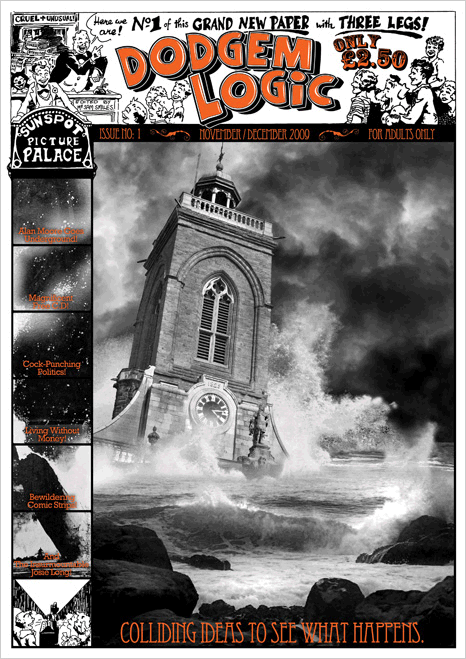
Mr. Moore is the editor and publisher of his very own magazine, entitled Dodgem Logic. Issue 5 (dated August-September 2010) has a few pages of comics (including one page by frequent Moore collaborator Kevin O'Neill), but it is not a comic book. Rather it is a handsomely designed magazine devoted to whatever topics Mr. Moore deems worthy, "colliding ideas to see what happens" as the cover blurb on the first issue proclaims.

If you already knew about Dodgem Logic, congratulations for having your finger on the pulse of pop culture. If on the other hand this all comes as news to you, well hey, that's what The Hayfamzone Blog is here for! Here is the magazine's home page, and let's check if ebay has an issue of Dodgem Logic for you over here.

Thursday, February 16, 2012

Jack Kirby and John Severin

Jack Kirby (above) and John Severin (below) were great comic book artists, and these excellent photos of the two gentlemen were posted this week over on the page of Vanguard Productions. It looks like Vanguard regularly shares vintage photos and you can visit them yourself over here.

Friday, February 10, 2012

Who Controls Art?

Of course our focus here in Hayfamland is on comic book artwork, but sometimes we do widen the focus (and longtime readers may remember that one Hayfamzone Blog article was about a family of ducks). My daughter Poth is, after all, a professional artist and so I keep one eye on all the goings-on in the world of art. Two recent events are worth bringing to your attention.

I. Unlikely Inference leads to Prize Revocation

For at least ten years now, the city of Chicago has had a contest to design artwork to adorn the annual city vehicle sticker that must be adhered to the windshield of every car and truck in the city. The contest is open to high-school-aged kids who were told, this year, to base their design on the theme "Chicago's Heroes." The entrants hone their designs in their school's art class and, after the ten best designs are determined by the contest-runners, the contending designs are presented in the Chicago Sun-Times and an online vote selects the winning design. Tens of thousands of votes are cast. In each previous year, the process went perfectly smoothly.

Immediately above, you can see the design that garnered the most votes this year and was declared the winner. No problem so far. But a day or two later the City Clerk announced that winning prize of a $1000 savings bond was being revoked from the fifteen-year-old special needs student who had drawn the artwork, and the design that had garnered the second-highest number of votes (and is pictured at the top of this article) would now be declared the winner of the contest. The reason given was that those hands in the design (reaching skyward toward the symbols of police and firefighters and medical professionals) could be interpreted as gang signs being flashed.

I was outraged, the boy's mother was outraged, the boy's teacher was outraged, and local newspaper columnists were outraged. (I very much like this Chicago Sun-Times editorial that points out the obvious gang signs in the Mona Lisa and other famous works of art.) The boy's teacher even showed the piece of clip-art of hands that her student had followed closely in drawing the hands of his design. The young man was even willing to re-draw the hands to appease the contest-runners, but they never even heard his offer. Here is a video of that young artist, proudly holding his artwork.

The young lady whose superhero-based design had been in second place wisely decided that she wanted no affiliation with this tainted contest, and she has withdrawn her submission.

II. Subject's Family disapproves Artist's Vision

There will be a memorial to President Dwight Eisenhower on the Washington Mall in Washington, D.C. Widely known and well-regarded architect Frank Gehry has been awarded the challenge of designing the memorial. For one portion of it, Gehry has proposed having a youthful and barefoot image of the future president surrounded by a montage of what he would accomplish later in life.  Eisenhower once referred to himself as a "barefoot boy" after World War II and Gehry expanded on this thread for his design. Here is an article with more details.

It turns out that the family of President Eisenhower is opposed to Gehry's design. They feel it juvenilizes a great figure of history.

I'm no fan of Mr. Gehry's more typical ribbon-based architectural designs, but I feel he is on target with this plan; his idea is out of the ordinary and thought-provoking and inspirational. Aren't those exactly the characteristics that an artist's idea should have?
Friday, February 03, 2012

Leaving Easy Tweet Behind

I joined Twitter in April of 2009 and quickly tired of it. In October 2009 I tweeted what I thought would be my last when I wrote "I'm going to hire someone to make my twitter posts. And that's what I call being on Easy Tweet!"

(I also 'vowed' when I started The Hayfamzone Blog that I would never embed images, but now I wouldn't think of putting up a post without an image to attract your eye. Things evolve.)

The hayfamzone is, quite literally, going places in 2012. (Keep checking back and soon I'll tell you what I mean by that!)

I invite you to click on the Twitter button that I've added on the right side of this page so you can follow me (and just in case something goes awry and you don't see any button, just search on twitter for hayfamzone and you'll find me immediately); I'll be sure to send out a tweet each time I post to the blog. I definitely want you to ride the Hayfamzone Starship with me, and 2012 is the year we're going to make the jump to warp speed!

Thursday, February 02, 2012

Mike Sekowsky and Ugg Boots


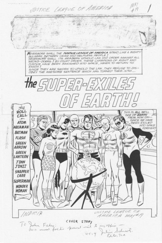
Ugg brand boots from Australia have carved out their own niche in the footwear world over the last few years. I have long hypothesized that their popularity is due to how much they approximate the appearance of superhero boots. After all, who wouldn't want to be and look like a superhero? The Uggs specifically bring to my mind superhero boots as drawn by Mike Sekowsky, and see if you don't agree with me when you look at this 1960s Justice League splash.


Well, an article in the newspaper this week slapped me with a bit of a comeuppance. It seems that the Uggs have been popular with some Middle School kids because the inherent looseness at the top of those boots allows the scalawags to hide from sight forbidden items like cell phones and switchblades and firearms. Who knew? So much for my superhero hypothesis!

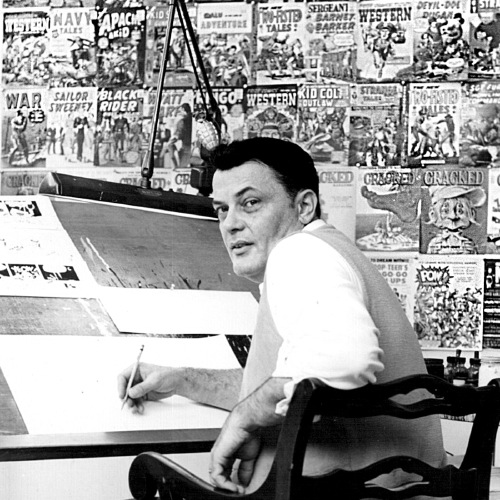
Well, anyway, here is a photo of Mike Sekowsky I came across while exhaustively researching for this article. When I first saw Marshall Rogers and Howard Chaykin in person I was struck by how much they resembled characters they might themselves have drawn, and I am struck that same way when I look at this picture of Mr. Sekowsky.