Tuesday, September 30, 2014

Letters of Stantis


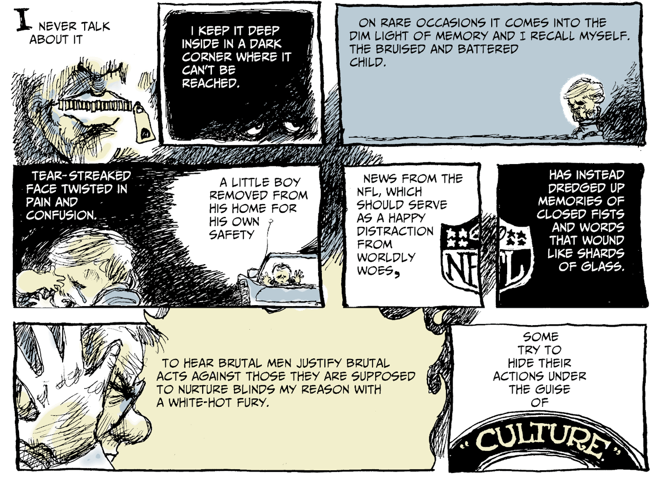
Scott Stantis is the editorial cartoonist for the Chicago Tribune and he produces other drawings for the paper also. Recently he drew a full-page special-feature autobiographical strip entitled The Beatings Never Really Stop. A portion of his page is shown above and you can see the piece in its entirety over here. What impressed me on first sight was the lettering. It exuded a warmth and friendliness that reminded me of Charles Schulz lettering at its very best.

Editorial cartoonists employ so few words in their panels that I (perhaps wrongly?) believe most of them employ hand lettering and not computer lettering in their work. It was with this mindset that I viewed the Stantis page and I said to myself that Mr. Stantis had distinguished himself with some beautiful hand lettering. Then I looked closer.

In fact the page is computer-lettered with a font designed to simulate hand lettering. How do you distinguish between hand lettering and computer lettering? My method is to examine the letter S. From just a cursory inspection of the above it is readily evident that all the S's are identical. No letterer could ever make all his S's identical, not Ben Oda, not Gaspar Saladino, nobody (and that lack of lockstep uniformity is what makes hand lettering superior!). Conclusion: computer lettering. It's good computer lettering, but still.

It has been my pleasure and mission to write often about comics lettering and I will continue to do so in the future.

Saturday, September 27, 2014

The 1968 Cover to Blackhawk #243


What is your first reaction when you look at the Blackhawk cover above? I'll tell you what mine was but first let me make the point that I never saw this decades-old cover before this year. I never previously owned a copy of the book, but I stumbled upon a postage-stamp-sized image of the cover drawing online someplace. And at first sight I screamed out "Sekowsky!"

I had never heard of the great Mike Sekowsky ever having had any involvement with the Blackhawk series in the 1960s so so I did a little investigating. Get this: the Grand Comics Database credits Pat Boyette with the pencils and inks and letters for the cover! I had to order a copy of the comic off ebay so I could look this drawing right in the eye, and I have now received the book in the mail.

The logo lettering and story title lettering are certainly by Mr. Boyette, as are all the little people running on the ground and so are all the little people falling from the logo and the ones standing on the logo and the ones above the logo. I'll say that even the hands of the Green Giant came from the hand of Boyette, but that giant's face is a Sekowsky drawing. Pat Boyette was not one to mimic another artist's style. I would, however, feel very comfortable appraising the inks on the Sekowsky face as being by Boyette.

Now let's move our sights over to the Blackhawk figures at the left edge of the cover. Even after just a cursory glance, one would have to agree that they are drawn neither by Sekowsky nor Boyette. From the postures of the three Blackhawks and the girl and her doll and the slickness of the inks on all of them, I propose that these five figures were pencilled and inked by Dick Giordano (who happened to be the editor of Blackhawk at that time). So what's up with all these different hands stirring the pot?

I'll tell you what I think. It was known that this issue 243 was to be the last issue of the long-running Blackhawk series that had been published continuously over the 27 years since 1941. I think editor Giordano wanted to let the title go out with a bit of a bang so he decided to make the cover a jam drawing between himself and two of his stable of artists to commemorate the passing of an institution. My opinion on the gentlemen's efforts? Mission accomplished with "Mission Incredible."

I like the artwork of Pat Boyette just fine, but every time I look at the above cover I will continue to scream "Sekowsky!"

Friday, September 26, 2014

Jack Kirby by Jeremy Kirby


This week I received a book in the mail that I've been looking forward to. Jeremy Kirby is the only grandson of Jack Kirby and he has put together Jack Kirby: A Personal Look. The book contains a number of wonderful photos of The King of Comics that I had never seen before, like the two shown above. If you're a Jack Kirby fan (and who isn't?), you'll want this item on the shelf in your home library.

Jeremy financed the book's publication with a kickstarter campaign and I was pleased to get in on the ground floor of his venture. On the closing pages of the book is a difficult-to-navigate list of the kickstarter-supporters. It took me a while to find my name in the list but, here, I'll point it out to you.


Thursday, September 25, 2014

Ken Jennings and Jack Kirby's Mother Box


Did we already known that Ken Jennings of Jeopardy fame was a fan of Jack Kirby's Fourth World? This tweet of his from today sets the matter in cement:

I would immediate switch to any cell phone maker that called its Siri equivalent "Mother Box."

Monday, September 01, 2014

Francoise Mouly and Comics


Francoise Mouly came to New York City from France in 1974 and taught herself conversational English by reading comic books. She published Raw Magazine with husband Art Spiegelman beginning in 1980. She veered toward the more educational side of comics with the later publication of Little Lit volumes. And an article in The New York Times two days back told me that she has formed Toon Graphics as an imprint of her Raw Junior with the explicit intent of producing educational comics for elementary school classroom use.

Out now is Theseus and the Minotaur and there is a good deal over on amazon so I might check that out. Among the upcoming releases will be Hansel and Gretel adapted by Neil Gaiman. These books aim to be Classics Illustrated for the modern age.

The newspaper article wraps up with Ms. Mouly expressing her distaste for the term "graphic novel." I am with her on that. They're comic books!