Friday, October 28, 2011

Prejudice Behind the Scenes of the Comics Page?

As a youth many years ago I used to read Broom-Hilda by Russell Meyers. The feature bowed in 1970 and still runs in the newspaper, but these days the only three strips I look in on daily are Ziggy (which I find oddly calming) and Frank and Ernest (still concocting new puns after all this time) and the brilliant Mutts (an indirect descendant of the nearly-divine Calvin and Hobbes, if only in my mind).

Though I may have outgrown Broom-Hilda, it is solidly done and it does have an audience. Apparently however that audience does not include the comics page editor of The Chicago Tribune, who has been trying to give this strip the heave-ho for a number of months.

A newspaper's comics page evolves over time for a number of reasons. Some strips (like Little Orphan Annie and Brenda Starr and, for that matter, Little Nemo in Slumberland) stop being produced by their writer and artist and thereby they leave the comics page; part of the circle of life, these self-terminations open up room for new features. Sometimes though a new strip becomes available when a newspaper has no space to run it; the editor may choose to cancel the newspaper's affiliation with a still-in-production strip in order to create room for a worthwhile new feature.

For a year or so, The Chicago Tribune has presented what they call their "Comics Carousel." A strip that is ensconced on the comics page is pitted in a head-to-head competition against a new strip that is published on a trial basis until readers weigh in regarding whether the old strip should be retained or should be discarded in favor of the challenger. All well and good. To me this has the aura of a game show or even a reality show, so maybe the Comics Carousel resonates with readers.

Presently in the Carousel, Broom-Hilda is up against some new thing called F-Minus (which, by the way, is exactly the grade I would give to it). (You can view a recent Sunday's Comics Carousel over here.) What strikes me as an irregularity is that this is at least the third consecutive time in recent memory that Broom-Hilda has been a contender in the bout. She keeps winning and the comics page editor keeps setting her up again, like tenpins.

Move on, I say. Broom-Hilda has successfully defended her crown repeatedly. This editor who appears so anxious to be rid of her should either pull the trigger once and for all or else leave poor Hilda alone.

Friday, October 21, 2011

Mystery Letterer Revealed

Some things you want to know are easy to find out. Others are not.

If you come across an unfamiliar word when reading you can, of course, look it up in a dictionary. But what if you know a word's meaning but can't think of the actual word? The dictionary would not be useful at all in that circumstance.

Comic Books are universal these days in their practice of giving credit to a story's writer and artist(s) and letterer and colorist. But you know that it wasn't always that way! Most comics in the 1940s and 1950s gave no hint as to the identity of the creative personnel responsible for the stories.

For about a decade now I have been particularly vexed by one unknown individual. The image above is a splash page from 1957's issue #21 of Superman's Pal, Jimmy Olsen. No credits are given. Any fan of Curt Swan will immediately recognize that the pencilling on the page was that gentleman's handiwork, and The Grand Comics Database (G.C.D.) has tutored me that the inker is Ray Burnley. But look at the caption and word balloon lettering. It is striking! The style is consistent and assured and just plain beautiful. All of the early Jimmy Olsen issues are obviously lettered by this same individual, but who could it be? I needed to know!

I tried every which way to get the information. First line of offense: the G.C.D. was unable to help, leaving the "letterer:" field for those issues blank. Second line of offense: online I found a Letterer Index from 2006; it showed samples of various 1950s and 1960s DC Comics letterer's styles but, wouldn't you know it, the one style which that index could not penetrate was shown on a sample page from Jimmy Olsen #13! Third line of offense: I reached out to Todd Klein and Tom Orzechowski, both of them well known to be scholars of lettering as well as expert practitioners themselves, but they too were unable to discern whose style it was.

So what's left for an information seeker to do? No other scholar of lettering leapt to mind, but maybe a scholar of comics in general might happen to possess this particular pearl of knowledge? I wrote to Mike Tiefenbacher and asked if he knew who lettered the early Jimmys. His answer?

"Sure, I know. It's Pat Gordon Sprang, Dick Sprang's then-wife. She started work at DC in the '40s as Dick's letterer, then got work on her own, and was one of the '50s mainstays. If I recall correctly, she worked there through about 1961, and when she left, Stan Starkman was hired to letter most of the books she had worked on for Jack Schiff (Mort Weisinger hired several temporary substitutes, finally settling on production staffer Milt Snapinn as his go-to guy). Again, this is from memory, but I believe it to be an accurate encapsulation of Pat's tenure there."

Well how about that. The moral of this story, if anything, would have to be the following: The way to find out anything you want to know is to ask the person who knows the answer! 

Wikipedia offers the following additional information. Dick Sprang taught his wife Laura A. Sprang to letter and color for comics; she subsequently took on the pen name of Pat Gordon and handled the lettering of most of her husband's stories (and here is a sample of their teaming from 1945). She later branched out and lettered for DC Comics apart from 
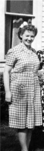
Mr. Sprang's stories. I found this vintage photograph of Pat Gordon Sprang.
RELATED POSTSCRIPT NUMBER ONE
Harry Mendryk has been examining lettering styles quite regularly lately over on his Simon and Kirby Blog. Great idea! From his writings I have learned how to recognize 1940s lettering by Howard Ferguson.

RELATED POSTSCRIPT NUMBER TWO
 I thanked Mike Tiefenbacher for his help and he answered, 
"Happy to share what little I know about this stuff! (I'm still trying to track down a '40s letterer who did a lot of work for Sheldon Mayer/Julie/Robert Kanigher, whom I've labeled "the Flash letterer." It's possible ALTER EGO has mentioned him in one of the many issues I have yet to read.)"  
If you know who that Flash Letterer might be, let's help Mike out!

RELATED POSTSCRIPT NUMBER THREE
After Mike T. revealed Pat Gordon to me as the mystery letterer, my thoughts started unraveling backwards and I realized that I had possibly met her! Back in either 1987 or 1990, the Guest of Honor at the Chicago Comicon was Dick Sprang and I took Little Mick with me to the convention. Mr. Sprang's very pleasant wife was sitting with him at the table the entire day! But it turns out that Dick Sprang and Laura A. (Pat Gordon) Sprang divorced back in 1951 so this was a different lady that I met. (By the way, the white-haired and bolo-tie-wearing Mr. Sprang very generously invited Little Mick to join him at the table and together they drew pictures of Batman for hours!)


Thursday, October 13, 2011

An Improvement?

This 1972 cover to Action Comics #419 is one of only a handful of times that penciller Neal Adams and inker Murphy Anderson worked together. Iconic, it was the pride of my original art collection for the twenty years that I owned it. To this day I use this Superman head as my avatar over on ebay. Here is what the printed comic book cover looked like:
That's correct, a photographic cityscape background was added, wonderfully successfully. Here is a vintage interview with former DC Comics Production Manager Jack Adler in which that gentleman makes clear that using a photographic background on this and other covers was his innovation (and did you know that the recently deceased Mr. Adler was a cousin of broadcaster Howard Stern?).

But the background was never affixed to the original artwork. Rather, a photostat of the Superman figure was pasted onto the New York City background on a separate, camera-ready production copy. A couple of years back I saw that page of production artwork in a gallery show, and it was somewhat striking to see the complete black-and-white cover image after having been so accustomed to seeing the white-background artwork that I had owned for so many years.

In 2006 I decided to downsize my art collection and I did allow this fabulous page to be grabbed out of my clenched fingers. While it was up for bid on ebay I received a very generous Buy-It-Now offer from Stephen Fishler of New York's Metropolis Comics and I even got a phone message from the son of Neal Adams, but the auction carried on to its closing seconds.

The winning bidder was a nice gent named David Mandel. Maybe you've heard of him? He was a writer and co-director of the movie Eurotrip (David receives one-third of a nickel for every copy sold of the DVD!) and he also wrote for ten episodes of Seinfeld. Just about every page of artwork I sold back then I packed for shipping myself (between two masonite boards) but this gem I left to the professionals at The UPS Store; David commented to me when he received the package that it was amazingly well packed (which it was; I think there was even a trap door in there someplace) and at that point I went back to UPS and passed the compliment on to the young man who had packed it (and gave him a little tip!).

So that was years ago, but then last week I happened to be searching online for the Action 419 image. Look at what I found:
This is in David Mandel's comicartfans Gallery Room, and in the description David thanks Gordon Christman for adding the photographic background to the artwork (PLEASE BE SURE TO READ THE UPDATE BELOW). I know that museums from time to time touch up masterpieces in their collection and David owns this page of artwork and it's his to do with as he sees fit, but I don't think I would have done this. That's just me! Maybe I might have imposed a photostat of the Superman figure onto the background while leaving the original drawing undisturbed, and then displayed the two versions side by side. What would you do?

By the way, David's collection on display at comicartfans.com is incredible. You can view it here.

UPDATE ON 15 OCTOBER 2011
If I were a proper journalist I would have thought to contact David Mandel about this matter beforehand rather than inviting him to read the article after it went live. David wrote me a note this afternoon saying that he did not permanently affix the background onto the artwork. "It is not attached, I would never do that to art," David explained to me in a gentlemanly manner. Rather, the cityscape is on an OVERLAY. I hereby apologize to David for having jumped to an incorrect conclusion.

Thursday, October 06, 2011

The Turtles, Through My Lens

 
One of my high school students asked me last week "Do people really look at your website? It's just about you."

Well, yeah.

I do try to get the tentacles to reach outwards sometimes, last week's little Mark Martin interview being an excellent case in point. But even on that front I do want to say a little more about me.

I reported in last week's article that Mark had drawn some Teenage Mutant Ninja Turtle stories for Kevin Eastman and Peter Laird. But let me tell you that I myself had an almost-run-in with the Turtles.

I started purchasing TMNT with their very first issue when it was released back in 1984. The comic was a fun send-up of Frank Miller's Ronin and I liked it.

After a couple of issues I seem to recall that Eastman and Laird started printing pin-ups of their Turtles on the (I think) inside back covers, as drawn by various other artists. I unwrapped a sheet of Craftint board and drew my version of those Turtles, and you can see the result above. I'm pretty sure I sent it in to them and I'm also fairly certain that it did not see print. If you know to the contrary that it did get published, please let me know! (And did you realize that Kevin Eastman used a few drops of his Turtle Money to purchase Heavy Metal magazine a number of years ago?)

Maybe you'd like to examine a larger image of the drawing, and you can do that here. You can read about late and lamented Craftint here and see some beautiful artwork utilizing it here and (gulp, here are two more by me) here and here.